Friday, January 31, 2014

CF#108 - home.

I have been waiting so long for the perfect color scheme to scrap one of the most special photos I have. This week's CSI case file was finally the one!  This photo was taken towards the end of 2003 when my husband returned from Iraq.  If there was ever a picture that could sum up the emotion I was feeling when I finally saw him, this is the one.  And if ever there was a blog post to tell the story, this is the one...because TODAY IS OUR 10 YEAR WEDDING ANNIVERSARY!  (Awwww!)  :)


Here is the scene this layout is based on, as well as a couple of closeups.  You can CLICK HERE to play along!


I've covered all of the colors in the scene, and for my evidence I used mixed media background, birds, newsprint, and stamps.  I used "tell a story you've never told before" for my testimony. Okay, so I have told this story before.  I confess.  But I haven't scrapped it. Plus this case file with its colors and evidence list was just too perfect for this photo for me to pass it by!  LOL


As luck would have it, when I grabbed a newspaper to use on my background, the World & Nation section just happened to have article headings that flowed perfectly into the layout like they were meant to be there.  Talk of budgets, peace, buses (seriously. what are the odds that day's paper would have an article on bus shut downs on the very page I opened up to?!), riots, conservative values...perfect.  I layered gesso over a piece of plain cardboard to get my foundation.  Then I just started tearing pieces out of the newspaper and adhering them to the page, layering them in some spots, then covering them with another layer of diluted gesso so some of the headlines would show through.  Then I added modeling paste, gelatos and Tim Holtz distress ink in spun sugar.  Tim Holtz got a lot of play on this page, actually.  I used his ink, his clock mask, and his birds in flight stamp.

I added the marine corps. insignia that I cut from an old pad of 6x6 paper, and then added my title, using white fabric Thickers inked with the Tim Holtz in spun sugar.


I finished the page off by adding my journaling strips, shaded with black chalk to look a little dirty/soot covered.  Lots of inking and chalking around the edges of the page as well, and then it was done!  I love this reminder of how far we've come in our 10 years of marriage (and 12 years together)...we were just kids in this photo - 23!  Ah, time flies. :)

Anyway, thanks for stopping by!  I love hearing from you!

xoxo,


Shawna

Thursday, January 30, 2014

Soooo....what is your OLW????

OLW.  One little word.  Or one big word!  Just one word.  Your mantra, your song, your center.  What will it be for 2014?

There's still time to play along with us over at Challenge YOUrself.  CLICK HERE and come play along!


Tuesday, January 28, 2014

Omnom!

Hey there!  Today I want to share a layout I made for the latest sketch over at Sketchabilities.  There is still a couple of days left to play along, so CLICK HERE to give it a try!

 I started out with a completely different picture and color scheme in mind but after 2 hours of trying to get my vision onto paper, I decided it was time to start over.  Hate it when that happens!  In this case, though, it worked out because I love the way this came out.  One of my favorite pictures of the kiddo and her trusty sidekick and big brother, Beau.  She was barely a week old in this photo and Beau was still trying to figure out where this little human came from and what her story was.  When he came in for a closer look and a sniff, his snout was mistaken for breakfast.  Haha!

Lots of Citrus Twist Kits goodies featured on this page, and 2 new shades of Heidi Swapp Color Shine (primrose and navy) that I am absolutely LOVING.  


Hope you got a giggle out of this photo and layout.  Enjoy your day!

xoxo,


Shawna

Monday, January 27, 2014

Another color challenge!

Hey all! I'm back with another layout created for a challenge over at the Memory Nest...this one is for their color challenge.  CLICK HERE to play along.  You still have 4 days.  Here are the challenge colors.  This challenge also came with a twist to include either a sunburst or chevron on your layout.


And here's my page.  I really enjoyed putting this layout together.  I used a 4x4 photo of this fabulous coffee mug I got for my birthday (thanks Wendy and Julie!) that has my nickname on it.  Ever since I took my husband's name (Saucier) 10 years ago, I've been called "Saucy" by my friends.  It fits.  I can be a little bit saucy! ;-)

Again I kept my page fairly simple.  I've really been digging pages with a lot of white space lately.  The papers were a mix of scraps from my stash, and then I cut out the blue and gold shape elements from the Good Tidings paper line from Chic Tags.  I did pull in a little bit of red in the flower cluster to compliment the lettering on the mug.  And, I added a doily of course.  I can't believe I thought doilies were so useless.  Clearly, I have been humbled.  I've been putting them on my pages quite a bit lately, and the lace detail and the bright white really do help give pages a little extra "something."  Oh, and I have the chevron twist in there in the patterned paper layered under the photo to the right, and again in the gray brad on the left.

Hope you enjoy my layout and that you come play along with the Memory Nest's color challenge.  Have a fabulous Monday!

xoxo,


Shawna


Saturday, January 25, 2014

Sketchy Solutions...

So I recently discovered a great challenge blog and online scrapbook supply store called  The Memory Nest and I decided to play along with their January sketch challenge.

+


Looks pretty easy right? Nope.  Not for this girl.  It's these simple sketches that stump me. Especially with a vertical 4x6 photo.  I've grown quite used to scrapping smaller, usually square photos, so to scrap a larger photo was more of a challenge than I expected (and I still had to skinny it up so it's more like a 3x6).

I started a layout with the larger squares of paper layered behind my photo.  Agonized over it for a couple of hours, then tossed it and pulled out a light grid covered cardstock and my good old Faber Castell gelatos.(shocker, right?) ;-)  Every time I have struggled with a layout I have ended up coming back to the gelatos and I always feel happy with the outcome.  So here's a bit on my process of putting together a layout using mediums as substitutes for paper elements on a page.  Give it a try!

For this layout, I used the gelatos as a stand-in for the lighter gray paper layer shown in the sketch.

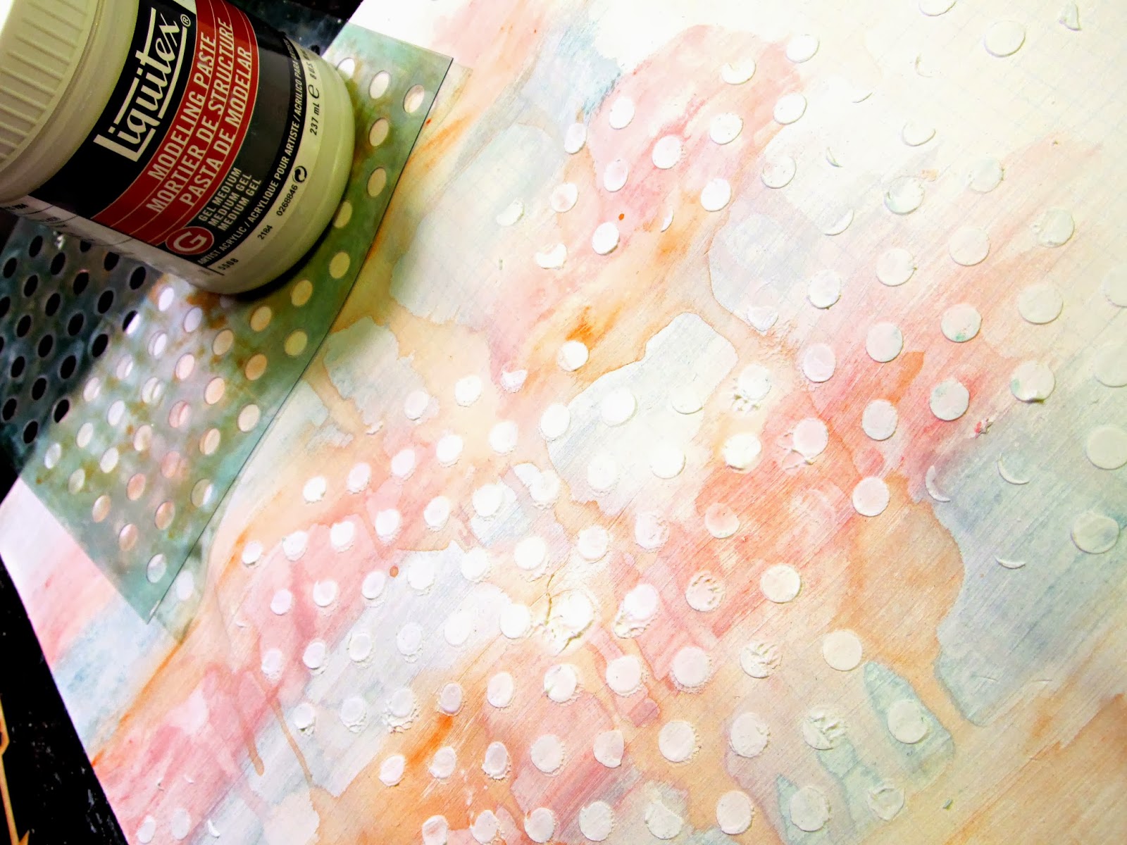
First I put a decent layer of gesso over the background paper.  Once that dried, I scribbled big lines of color with the gelatos, finger blended them, then went over them with water and a watercolor brush.  If you want your gelatos to blend well without hard lines, apply them softly to the paper - you don't have to press down hard at all.  Then wet a watercolor brush and apply a generous amount of water on the lines that separate your rows of color.  Blend the colors out until they look the way you want them.  I stood my paper up and tapped it on my desk to get the colors to run into each other and make some dripping and pooling.


I used a stencil and added some circles with modeling paste over the gelatos, then layered strips of vellum to stand in for the darker gray paper in the sketch.


 A few hearts, a button flair, and a little bit of doodling.  Viola.  A super cute pastel page of the kiddo. :)  I switched the elements but stayed pretty close to the sketch shape.


I hope enjoyed this little how-to...and link me to your layout if you give this technique a try! :)

Have a fabulous weekend!

xoxo,


Shawna


Friday, January 24, 2014

CSI CF#107 - Snowgirl!

Happy Friday (finally)!  Today I am sharing a layout I put together for CSI's latest case file.  CLICK HERE to play along!

This was such a fun color scheme.  I love bright and bold, and this file certainly delivered!  Here is the "scene."


And here is my layout.  I scrapped these photos in a circular fashion for another layout created with the sketch from ScrapFriends last month, but these photos never get old and this layout tells about how that giant snowman came to be.  For my evidence I have used a wet medium (Heidi Swapp Color Shine mist in Mustard), umbrella (see it peeking out on the top under the "this" arrow?), raindrops (also behind the "this" arrow), and patterns.  For my testimony, I used the 1000 Awesome Things link and used the awesomeness of a snow day for my inspiration.  The journaling talks about how fluffy and not sticky the snow was, and how we were super lucky to have daddy shovel up a huge pile of snow that we were able to basically carve our giant snowman out of. :)


Here are a few close-ups.


I hope you will stop over and visit us at CSI.  I would love to see your creations in the gallery this week!

xoxo,


Shawna

Thursday, January 23, 2014

Mini Me.

While this is not the most flattering post-baby photo of me ever, I'm still glad that the hubs sneaked a photo of me sleeping with our little lady when she was still itty bitty because it shows perfectly how similar we are in our mannerisms.  To say this kid is a mini me is truly the understatement of the century.  Since the moment she was born, she has been like a little reflection of me.  Back when she was a baby, it was mostly just mannerisms.  These days, it's the whole shebang.  She looks like me, she talks like me, she walks like me, and I swear she even thinks like me.  I have not yet decided whether this will be an advantage or a hindrance come the teen years... ;-)

So here's a layout memorializing those early similarities.  I love my mini me. :) Thanks for having a look!

(PS.  When you leave here, stop over to Terhi Koskinen's blog for a fantastic way to get natural lit photos of your work...I wish I had seen her post prior to photographing this project, as it would have eliminated the shading in the lower left of my page, but I will definitely be using her technique on future layouts!)

xoxo,


Shawna


I pulled out my Sew-Easy kit to do the stitching across the top of the page.  I don't get as much use out of it as I thought I would, but it does help to perforate the paper in the stitch design of your choosing and definitely makes poking the needle through a lot less of a pain (literally).


Tuesday, January 21, 2014

Mini Album Workshop!

Hey, all.  Happy Tuesday!  Today I'm sharing a mini album that I made in preparation for a scrapbooking workshop I am hosting on February 1st.  (If you are in the area, there are still a couple of spots open so contact me to register!)

I got these great Heidi Swapp wooden mini albums for a steal and decided since they were such a good deal, and the heart cover was so perfect for Valentine's Day, I would order them for the entire class and make them our February project. Because the class is a 3-hour class, aside from coloring the bare wood red with Heidi Swapp Color Shine, I stayed away from a lot of mixed media and kept the pages fairly simple, with just a variety of papers and embellishments.  If you subscribe to Citrus Twist Kits, you will notice that this album is about 80% January kit contents.  The papers were absolutely perfect for this project!

Here is my album, with pictures of my mini taken throughout the year.  Hope you enjoy!

xoxo,

Shawna


Friday, January 17, 2014

CSI CF#106 - Remember.

Happy Friday everyone!  CSI's latest case file is up and ready to be solved.  CLICK HERE to play along!

This week the colors are so soft and pretty and I found the scene a great inspiration and the perfect chance for me to celebrate the life of my late dear friend, Meagen, who passed away last November in a tragic car accident.   It is so important to me to keep her memory alive, and to make sure that I share stories of her with her young children, so they never forget what an incredible mother and friend she was.  What an inspiration she was. The journaling, on the back of the layout, uses the inspiration word "bright" and talks about what a beautiful bright light she gave off, and how she touched everyone who ever met her.

For my evidence, I have used an ombre effect, arrows and circles.


The background was created on watercolor paper with a mixture of gelatos and mists (both mixed and poured on in liquid form).  Lots and lots of layers of colors in peach, red, and yellow tones.


I added some polka dot stamping behind the photo and cluster and unfortunately realized a little too late that I wasn't going to like the end result, so I ended up just adding more layers and covering some of the polka dots up to soften up the look.


Thanks for reading, my friends.

xoxo,

Shawna

Monday, January 13, 2014

Exciting News!

I'm so happy to announce that I have been selected to be a member of the Sketchabilities design team!!  I've recently posted about the wonderful sketch challenges over at Sketchabilities and am honored to be able to create design team inspiration layouts around the fabulous sketches!  Sketchabilities hosts weekly challenges with fantastic sketches to get your creative juices flowing.  Please come join us!


Saturday, January 11, 2014

Blast Off!

Hello!  We have an awesome new case file up at CSI and ready to be solved! CLICK HERE to play along!  Since this is the 2nd week of the month, this week's file is accompanied by an awesome sketch by Page Drafts' sketch master, Em Straface!  Here is the file:


And here is my take on it.  I was inspired by the scene to pull out an old photo of the kiddo blasting off in her rocket costume. (Note:  you can stock up on the best dress up clothes on clearance right after Halloween for CHEAP!)


For my evidence I chose stars, circles and planets.  For my testimony I chose the inspiration word "away" and wrote: "Up, up and away! There are no limits on what you can accomplish when you reach for the stars!

I hope you will come play along with us.  Have a great weekend!!

xoxo,

Shawna

Tuesday, January 7, 2014

One Little Word....

It's a New Year and the perfect time to hop on board and play along with us at Challenge YOUrself! Afterall, isn't that what we all resolve to do in January of each year?  Challenge ourselves.  To do better. To be better.  Or just to love ourselves more just the way we are?  I don't make a huge deal out of resolutions, because I have a hard time sticking to them, but I do have a couple biggies this year and I intend to put my all into incorporating them into my life.

On that note, here's our next challenge for YOU.  Choose a word that you will focus on and reflect upon throughout the year.  Your One Little Word.  Your mantra.  Your "I can do this" and "I will do this."  Pair it with a photograph of you.  Once again, you have an entire month to complete the challenge (deadline is February 5th), so plenty of time to think about your word and get your layout in.  All you have to do is link up your layout on the blog and you will then be eligible for these adorable Tim Holtz, Basic Grey, and Crate Paper button packs!


My One Little Word for 2014 is "present."  And not present like a gift under the tree.  Actually present..for life.  Less time plugged into electronic devices and behind the camera and more time spent actually living.  I want to be "all in" the moments of my life.  Be totally there -  hearing what is being said, doing what is being done.  This is a biggie for me and I will reflect on my word frequently.

What will your One Little Word be?

The splashes of color were done with the 50s Diner pack of Faber Castell gelatos...if you are a gelato fan like me,
this is an amazing color combo of gelatos worth checking out!


Enjoy your day!

xoxo,

Shawna