Saturday, September 6, 2014

Challenge YOUrself - Fall Favorites

Hi everyone!  Today I'm sharing a layout for this month's Challenge YOUrself challenge.  We want you to tell us your favorite things about falls - is it the colors?  The smells?  The temps?  Sending your kids back to school?  Tell us about it!  I personally love everything about fall.  It is my favorite season, and my only regret is that on its heels comes winter...and winter lasts entirely too long around here.  Fall for me is a time to express thanks for my family, through endless activities and festivals, and plenty of time outside where the temperatures are mild and the foliage colors literally look like they're straight out of a painting.  Here is my layout.  CLICK HERE to see what the rest of the design team came up with.


I used a little bit of everything to put this layout together - pulling from my embellies from Maggie Holmes for Crate Paper, Basic Grey, and Heidi Swapp.  The papers came from my August Citrus Twist Kits and I could not wait to use this paper of wheat fields in the fall!


I pulled gold in by layering this Studio Calico  vellum paper in around the main paper, then spritzing these Heidi Swapp chipboard hearts with some gold Heidi Swapp Color Shine.


These Studio Calico word stickers serve as my journaling for his layout, and sum up my bottom line of happiness in fall.  Time with my family. :-)


The title letters are rub-ons that are from my stash.  Would you believe they're literally like 8 years old?!  Hoarding comes in handy once again. ;-)


Thanks for visiting!  I hope you will play along with us this month!

xoxo,


Shawna

Friday, September 5, 2014

CSI #138 - Geometry

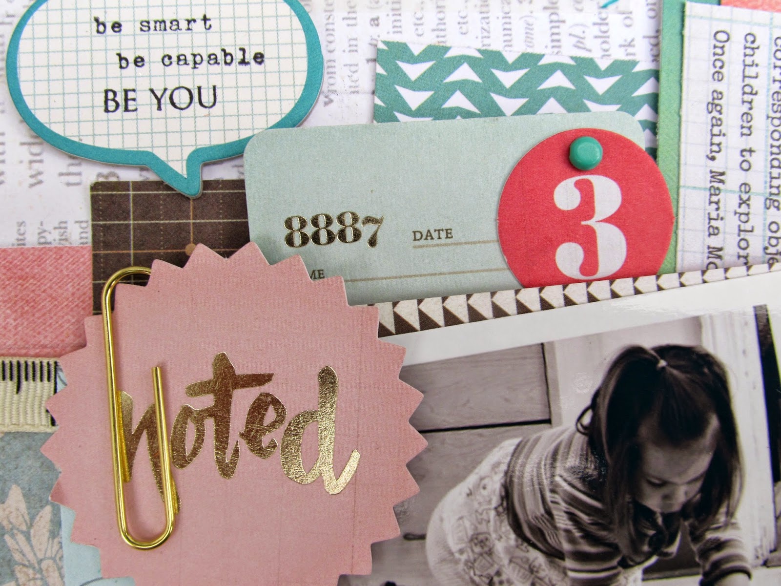
Well, we've got the first week of school under our belt and everyone survived, so I'd say we're off to a good start. :)  This week's case file was perfect for school photos, and the Crate Paper Noted line that came in my Citrus Twist Kit for August was the perfect line for this theme.  Here's my layout and of course the fabulous CSI case that inspired it.  CLICK HERE to see the rest of the design team line up.


At first the colors freaked me out a little bit.  I'm a fan of bright, and the muted tones looked hard to work with.  Luckily I had just gotten my CTKit, and it was filled with colors that fit this case perfectly. For my evidence, I used woodgrain paper, an envelope, tags, numbers and clips.  Here are some closeups.


For my testimony, I used the prompt to journal about school.  In these pictures, the Little Lady is laying the ground work for a solid foundation in math, and I talked a bit about what each activity was, and how it relates to learning.  At first glance, it looks like a simple game of stacking, but it's so much more.  The journaling reads:

One of the most famous visual representations of Montessori is the Pink Tower, which is introduced to first year primary students around age 3.  Through the simple act of building the tower, children learn visual discrimination of dimensions, while refining visual-motor coordination and getting early preparation for later math lessons.  Shapes play a big roll in early Montessori learning, and after a child has exhausted the Pink Tower work, they may move on to work with geometric solids.  This builds on the foundation of dimensional awareness, and refines the stereognostic sense.  Children learn the names of the forms, including sphere, ovid, ellipsoid, cone, cylinder, cube, triangular pyramid and square pyramid.  Children grow their language by learning the proper names of the solids, eventually matching labels to the corresponding object.  All of this shape work sets the stage for geometry, by allowing the children to explore the relationships between the plane and curved surfaces of the shapes.  Once again, Maria Montessori's approach is nothing short of genius in its simplicity.


For the title letters, I pulled out some more of those good old canvas thickers, and I covered them with some Tim Holtz distress pain in spun sugar, then going over them with a cream color to tone down the pink a bit.


And there you have it.  I hope you have lots of fun planned for your weekend.  It has been really hot here lately, and I am looking forward to the fall weather that has been promised for the weekend!

xoxo,


Shawna

Friday, August 29, 2014

Keep calm, and drink wine.

TGIF!  I really need this 3 day weekend in a bad way.  Been a crazy couple of weeks, and with school starting next week, it's bound to get even crazier.  Pile a nasty cold on top of it all, and I'm a regular hot mess.  Which makes this layout timely. ;-)  Today I'm sharing my take on CSI's latest case file.  CLICK HERE to see the full design team reveal.  Here is my layout and the case:


When I first saw the color scheme, I was a little worried because I had a hard time visualizing all of those colors together.  To make them work, I took a photo that was taken of me during a recent photo shoot and turned it black and white, sprucing it up with a bokah treatment.  Then I took the color scheme and incorporated lots of black to make everything pop a bit.

I didn't have a ton of embellies in the case colors, so I turned to my gelatos and some Tim Holtz distress paint to bring them into the background. I used a Heidi Swapp mini stencil to add some triangles, coloring them in with gelato and then taking a wet paintbrush to distribute the color a bit, then outlined some with a black gel pen.  Then I used the distress paint to make some drips.  I love the way the drips came out - the one that runs the length of the right side reminding me of a twister tornado, which is what this whirlwind that we call life feels like to me some times.


I literally had no papers in the case colors, so I took a sheet of vellum and pulled out the trusty old typewriter to make a mat to put my photo on.  I love the look of the repetitive days of the week back there.


My little phrase stamps from various Citrus Twist Kits always come in handy and I layered a few of them underneath the photo here.


Finally, I added the journaling.  I loved the testimony prompt about journaling about your attitude about something.  I don't know about you, but when things feel really overwhelming and I am in dire need of some relaxation, I love putting my feet up with a glass of wine and just vegging out for awhile.


On that note, there's a couch and a glass of wine calling my name right now.  (Okay I lied...Nyquil will be standing in for wine tonight.  I told you.  I have a cold! LOL)   Have a fabulous weekend everyone!

xoxo,


Shawna

Friday, August 22, 2014

CSI #136 - Books.

Happy Friday!  Ah, I love Fridays.  This was a ridiculously busy and crazy week and I am so happy to have nothing but hanging out on tap for the weekend.  The fair is in town so we might head out to see some animals and ride some rides, but other than that, I'm crossing my fingers for lots of R&R.

Another reason to love Friday?  Another CSI case file ready to be solved!  I cracked this week's case by scrapping one of my favorite solo past times...reading.  I love books and I'll read anything and everything, really. I most frequently read fiction...and National Geographic magazine.  I love me some National Geographic. ;-)

So here's my layout and the case file.  CLICK HERE to see the rest of the design team's reveal.


I found this quote on pinterest and thought it was spot on.  I absolutely love the way it describes books and the way the words are whispered to us right inside our heads.  Carl Sagan nailed it. :)


 I'm too tired for details tonight so I'm just doing a drive by share before I settle in for some mindless t.v.  Enjoy the weekend everyone!


xoxo,


Shawna

Monday, August 18, 2014

Grow

Life.Paper.Scrapbook has just released an awesome mood board that is totally  inspiring, with its rich colors and textures.  As soon as I saw the knit blanket in the photo, I thought of this photo of the Little Lady wearing my knit winter hat, and this layout was born. :)


 Here is the yummy mood board.


It was fun layering all of the random embellies in my stash that fit the color scheme.  I didn't really use much of any one paper line, and instead grabbed a little bit of everything and mixed it all together.  I ended up with a color palette that manages to incorporate the majority of the swatches in all three color schemes.  I love how this button came out - it was a light beige opalescent button, and I grabbed some Tim Holtz Distress Stains in Dusty Concord, Spiced Marmelade and Crushed Olive and swirled them around to cover the button.


Felt good to use up some of the huge pile of phrase paper strips that I have overflowing from my paper drawer!


Scrappy Canary is sponsoring this challenge again so come over and link up your take on the mood board!  Have a great week!

xoxo,


Shawna