Saturday, May 31, 2014

CSI #125 - Grace

Was hoping to get this posted last night, but man..I was wiped out from the week and ended up curling up and watching Wolf of Wall Street instead. (Holy crazy movie, Batman!)  So..Happy Saturday!   I hope you all have a fabulous weekend planned.  I have a full day today starting with horseback riding lessons for the mini, a nature walk and a picnic, then an outdoor movie night tonight.  Going to be a beautiful day!

CSI has just revealed its latest case file and I am sharing my layout for it.  I love the way these colors work together against a white background and I was happy to finally scrap a photo from my garden last summer! :)

Here's my layout.  CLICK HERE to see what the rest of the amazing design team came up with.


For my evidence, I have flowers, something sheer (vellum), quatrefoil pattern (I had to google that by the way - I had no idea what it was, but was happy to find that I had a mask in a quatrefoil pattern), something puffy (quilted flair button) and decorative frame.


I was inspired by the word "time" and chose the quote at the bottom of my page as part of my journaling, expanding on it behind the photo.

The quote at the bottom is a bit hard to read, but it is by Mary Sarton and says "Everything that slows us down and forces patience, everything that sets us back into the slow circles of nature, is a help. Gardening is an instrument of grace."

I found it to be the perfect quote to sum up how I feel about my garden.  In the spring of 2013, I planted my first garden; all organic, and mostly from seed.  Every morning and evening I went out to check and see how it was coming along...although every day each little plant grew just a little bit more, it was well over a month before I had any harvest to show for all of the effort, and this perfect little snow pea was one of the first things to grow.  No matter what I did to encourage the plants to grow faster, time was in charge and I had to learn some serious patience while I waited.  By August, the garden was so big it was spilling over in all directions with various vegetables ready for harvest.  So totally worth the wait!

I wanted to share my process for how I made the little coke bottle flower embellishment.  I found this great stamp on clearance at Jo-Ann Fabrics and paired it up with some watercolors for a homemade embellie encompassing all of the colors in the case file.


I started with watercolor paper, and stamped the image with archival inks.  Then I mixed some watercolors to get the shades I wanted for the bottle.


Lots of water and lots of color and here's the final product.  I fussy cut one of the images out and popped it up on my layout.


Here's a closeup of the stamped image (the ones above were still wet when I photographed them).


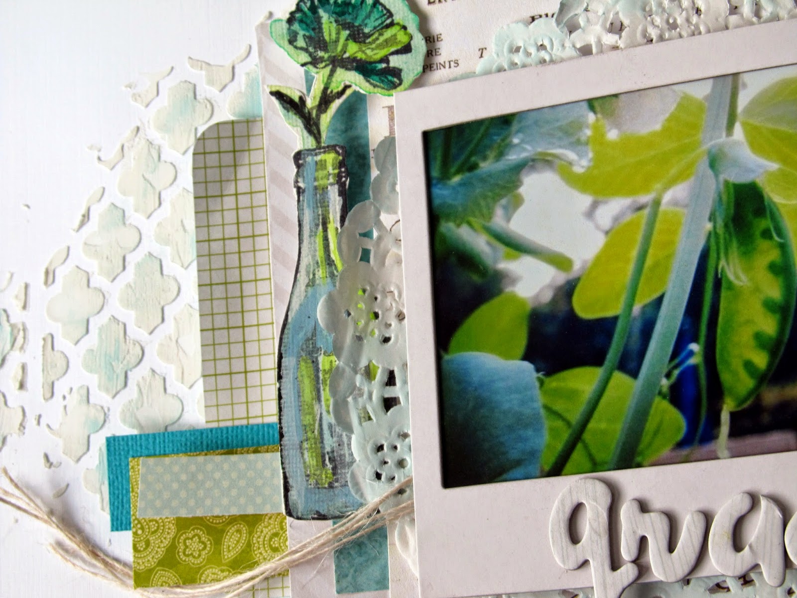
In the background, I used the quatrefoil mask and then lightly rubbed a small powder blue inker over it once dry.  Love the effect it gave.


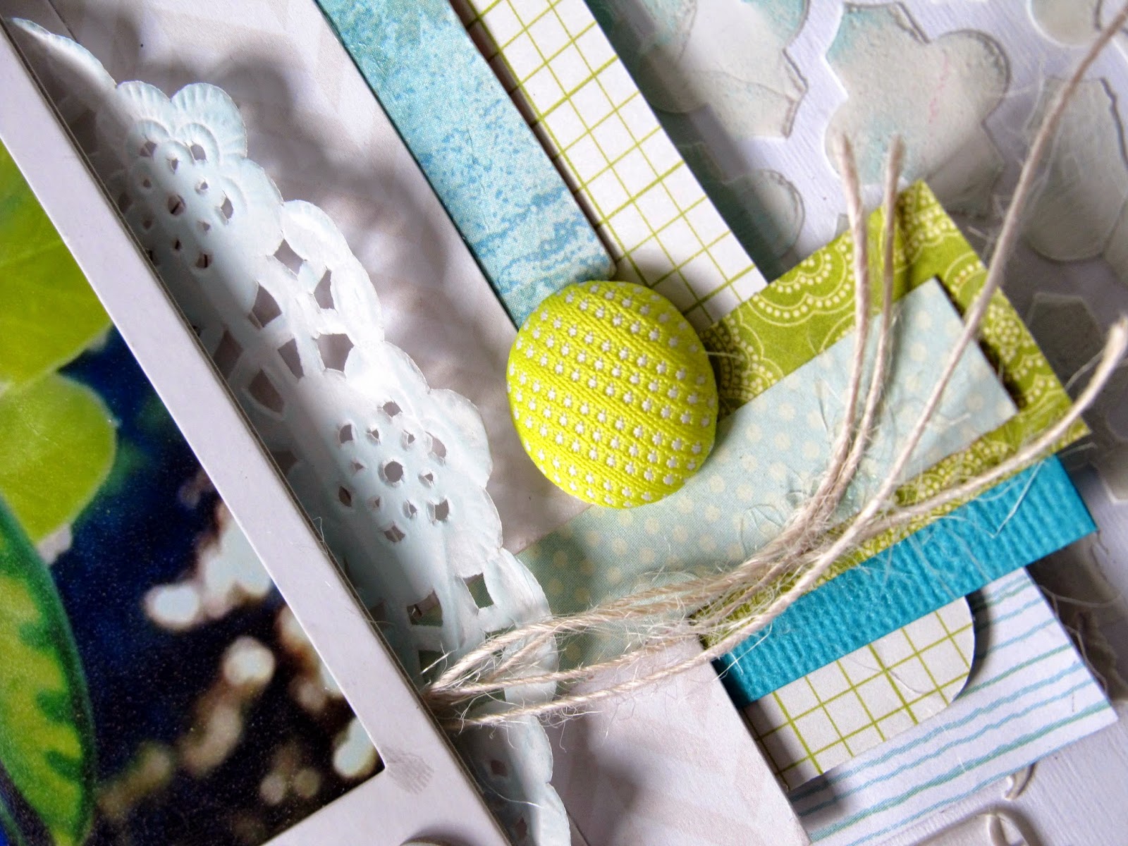
A closeup of the quilted button from Basic Grey's "Hey Kid" collection.  I am absolutely loving this collection and have mixed it in to quite a few layouts lately.


The top corner was completed with some vellum and paper layers, a clear circle, and a K&Co. garden design flair button.


I used the title word "grace" pulled from the quote.  Love the little clear "oh happy day" sticker I found at Michael's.


And that's it.  I wanted to  be sure I kept lots of white in this layout because I just love how it makes the greens and teals pop.  I love this one and think I am going to make a book of my garden trials, tribulations and adventures. :)

Enjoy the day everyone...see you soon!

xoxo,


Shawna

Friday, May 30, 2014

Tree Pose

Good morning and Happy Friday!  Today will be a day of blog posts, as several of my design teams have reveals scheduled to go live today.  First up, Sketchabilities!  Sketch #116 is live and ready to inspire.  Even better, we were lucky enough to receive some fabulous chipboard from Creative Embellishments to work with.  Creative Embellishment sells some seriously awesome, high quality chipboard.  CLICK HERE to visit their online store.  And, CLICK HERE to see what the rest of the talented design team came up with combining their chipboard with the sketch!

Here is my layout.


And here is the sketch.


I chose some awesome geometric shape chippies to work with and covered everything in a layer of gesso to start.  Then I went over the shapes with lots of gelatos to pull in various colors in the photo of my little yogi.  


Here are some closeups.  Because the shapes made such an impact, I kept the rest of my embellishing to a minimum.  For my background, I started with some Heidi Swapp color mist in Blush and Gold, then went over it with some green ink and a Tim Holtz mask.  I added a little bit of shading with a sharpie and some gold Liquid pearls on some of the squares, as well as on the background of the page.


Great gold title letters from American Craft Thickers!


And there you have it!  Make sure to stop by Creative Embellishments and check out their chipboard.  Then come on over to Sketchabilties and put your chipboard to use! :)  See you later this evening with the latest CSI reveal!

xoxo,


Shawna

Monday, May 26, 2014

I am thankful...

It's an "anything goes" month over at Once Upon a Sketch, with a fabulous sketch, and the freedom to pick whatever journaling subject you choose.  Usually, they'll give you an inspiration phrase to spark your journaling (which I actually love  because sometimes I get a total mental block), but this month you can journal about anything your little heart desires. ;-)  I'm so glad I found the time to play along with a couple of challenge sites this month, aside from my normal design team work.

Here's my layout.


(So bizarre how the striped paper behind the photo seems to show through in my skin...you can't see it in real life.  Ah, well.  lol)

And here's this month's sketch inspiration.


While I followed the general shape of the page, I did move my title and my journaling is spread around the page.  I started out swiping some gesso across the page horizontally, and then added some mint green Heidi Swapp mist.


I crumpled some vellum paper (Recollections and Maggie Holmes) and used it to give texture above the gesso and mist.  Then I worked some ribbon in and added some of the great papers and embellies that came in this month's Citrus Twist Kit.  Don't you just love those wooden scallops?!


I used the gesso in random spots around the page to tone down the background paper and to serve as journaling spots, and then I made a list of all of the things in my life that I am thankful for right now.  


Big thanks to Once Upon a Sketch for the inspiration.  Happy Monday everyone!

xoxo,


Shawna

Sunday, May 25, 2014

Look Ma!

Playing along with Scrap Around the World this month and was thrilled to see the gold in this month's mood board.  My Citrus Twist kit this month was filled with hues of gold just perfect for the board. Here's my layout of the little lady's first horseback riding lesson.  She asked me before we went if they were going to let her ride no-hands, and of course I said "I'm sure they will not!"  Well, I stand corrected...apparently no hands is a great way to learn to balance and sit straight in your saddle.  I love these photos...horses are so majestic and it's beautiful to see my daughter's love for them and her bravery when it comes to leading and riding.

I took these photos on my phone, so they didn't print very well due to the low pixels, so I printed most of them fairly small which worked out nicely, because I don't often manage to squeeze multiple photos onto one layout.


And here is the beautiful mood board that inspired the layout.  I was mainly inspired by the gold and the doilies.


I've had these glittery thickers in my stash for awhile now, and haven't managed to work them into a page.  I pulled them in through the navy in my daughter's sweater and her instructor's jacket.


This fabulous horse came from a Studio Calico chippie set, and there are gold doilies peeking out from under the photos.


I love all of the phrase stamps that come each month from Citrus Twist.  No matter what sentiment I am looking for, there is sure to be a stamp that says what I want it to say.  The folder and card that I stamped on are from Basic Grey.


I handstitched a bit over the honeycomb gold flecked vellum paper, and went over some of the white chevron with a mask and some modeling paste to give it a little bit of added texture in the background.


And there you have it!  Hope you are all having a fabulous weekend.  I'm getting back outside today to get the compost and dirt into my garden beds and hope to plant tomorrow!  Gardening is one of my favorite things to do and I can't wait to see how things grow this summer!  See you later!

xoxo,


Shawna

Friday, May 23, 2014

CSI #124 - Dream...

Happy Friday!  It's that time again...CSI's latest case file!  This one was my favorite for May. Gorgeous color, and great "evidence," perfect for this shot of my daughter blowing glitter out of her palms on a winter day.  (Photo edited to fit the case, but the original photo is every bit as amazing and is courtesy of Ashley Jannson photography, who did an amazing job capturing the magic of our little lady.)  CLICK HERE to see more of Ashley's work.

Here is the case file:


And here is my take on it.  You can see more of what the talented design team came up with by CLICKING HERE.


I've used this technique a couple of times when I need a large circle shape (I don't have a ton of chipboard, and definitely not chipboard that large)...I used watercolor paper and added pink, gold and orange gelatos to it, and some random gold swirls with gold Liquid Pearls, then cut the paper in a circular shape to use behind the photo.


I took the "glitter" as evidence prompt seriously and even added some glitter on the photo to enhance the shot of the glitter being blown, and used many shiny elements, including the the title letters, which are American Craft Thickers.


The background is a mix of gelatos and Heidi Swapp Color shine in blush and yellow, with lots and lots of glitter added in and sealed with acrylic.  I also added some leaf stencils with modeling paste just to break it up a little bit.


I have accumulated this great little collection of flowers from the Michael's dollar bins, and I've been using them quite often lately.  I'm not normally a big flower fan, but they're growing on me!  This time, I layered them over some wrapped silver ribbon, and added a pretty gold pin, and some jeweled buttons and sequins as well.


Here's a better shot of the added glitter.  I found some stretchy silver twine which worked nicely to bring a little extra texture in.


Finally, for my journaling, I used the inspiration word "dream" and found this fabulous little quote on Pinterest that seemed to be written for this photo.  I wrote it right on the photo in a vellum pen, and you can see that it was a little tough to write neatly (I'm a leftie and EVERYTHING is hard for me when writing because my hand brushes across and smears the ink or the pencil lead.  Such a pain.  Anyway, I digress...)


And there you have it!  Come play along with us.  This case file can be interpreted in so many different ways!

Enjoy the weekend, friends, and for my US friends, enjoy the long holiday weekend and please remember what Memorial Day is all about...as the wife of a (non-active duty at this time, thank goodness) member of the US military, I know all too well how different our lives could have turned out, had I lost him to war.  Please take time out of your weekend to remember and honor those who have given their lives for our country.  You (and I) wouldn't have all we have without their bravery, service, and sacrifice.

xoxo,


Shawna

Friday, May 16, 2014

CSI #123 Smile...

Yep, it's that time again!  Happy Friday everyone and welcome to the weekend!  We've had one heck of a week around here.  The little lady came down with a case of contagious kid germs (lol), our cat had to have his tail surgically amputated due to a nasty infection(seriously!), and our dog...well, it's just another day for him.  No tail amputation in his future.  LOL!   Needless to say I'm feeling very TGIF-y. Anywhoooo...CSI is back with another fabulous case file with such a striking color scheme and great scene for inspiration.  Here's the case fule:

And here is how I cracked the case. CLICK HERE to see how the rest of the talented design team solved the case.


For evidence, I chose a mixed media background, wings (butterflies), rub-ons, and mistable elements.

I absolutely loved these colors and had mists in each of the 5 main colors, so I used them in layers over watercolor paper, and used black mist, modeling paste and masks to add some texture and dimension. I also had some great wood stamp butterflies that I scattered around in the back.

The Tim Holtz stamp was perfect for this layout, because this photo was taken at a "Super Mom" photo shoot that I was nominated for and won (yay!).  For an entire evening I had no other agenda than to sip some wine, share some laughs, and have some photos taken of me doing something other than being a mom.  Alexis Emm Photograffi is a super talented photographer and I was so lucky to have the opportunity to be photographed by her! CLICK HERE to see more of Alexis Emm's fabulous work.

For my journaling, I wrote a fairy tale and added it digitally to my photo before I printed it.  For those of you old folks out there who can't see the writing clearly (I say this with love, I swear, because I'm squinting to see it myself LOL!) it says:

"Once upon a time there was a girl, who met a boy, married a boy, and started a family...years went by and the girl worked very hard to balance home, family and career...sometimes she felt like she was 80 years old; sometimes she felt like she was just a "mom"...but on days like today she felt like so much more...she felt young, strong and fun.  She was a mom, she was a wife, but she was (and is) still she...even after all these years."

...and I should have added..."and they all lived happily ever after. The End." hehe ;-)


The white ruffle is from The Paper Company, a Hobby Lobby brand, and the lace doily looking sticker is Recollections, the Michael's brand.


Layered up some more Heidi Swapp in the sparkly pink button and the fun flair button.  The corkboard butterfly is from Studio Calico.


I've had these great Heidi Swapp rub on circles for quite some time and they were perfect to add a little detail around the scribbed circles I drew behind the photo.


Heidi Swapp makes an appearance again with the "smile" title word. LOL She totally monopolizes this layout. ;-) I can't recall the manufacturer of the Take Note journaling pocket but it is the cutest!


I hope you've enjoyed the closeups!  I really appreciate the visits, comments and support.  Enjoy your weekend!

xoxo,


Shawna

Live auction signs for a cause!

I was honored to be asked by my daughter's school to design the display signs for the live auction items up for bidding at this year's fundraising gala.  The school is raising funds for the demolition of an unused building and the installation of a new athletic field.  As a not for profit, fundraising is BIG at her school, and I wanted to show off the auction items in a fun, appealing way.  So I did some large canvas displays for the items and oh my gosh was it fun to put these together!  I loved working on such a large surface and working on canvas was a new adventure for me.  Here's what I put together.


I created the background on this one with a stencil and modeling paste, and then misted it with shades of red, purple and green.  A few sticks from the yard and some pretty flowers complete the serene spa scene I was going for.


For this sign I started out by painting the entire canvas with black acrylic, then added the main wording with a t-shirt iron-on that said "I love soccer."  Then I added a row of stars with modeling paste, and found some great soccer embellies to scatter about.


I wanted an earthy feel for this sign advertising sugar maple trees up for auction, so I sprayed the entire canvas blue and added a layer of self-adhesive moss (this stuff is MESSY so if you try it, be sure to cover it with an acrylic sealer to keep the shedding to a minimum).  I love the look though, and actually bought some more moss and earthy textures to use on future scrapbook layouts.  Then I rounded up some more sticks from the yard, and added them to some leaves from our door wreath from last fall.  Thriftiness rocks! ;-)


There were many teachers who volunteered their time for outings with the kids and this is always a big hit at the auction.  I grouped the descriptions on one board that I decorated with mists and gelatos, and big chipboard letters that I painted black.


This is one of my faves.  Had so much fun on this one.  Spraypainted the canvas black but kept the coverage lighter in some areas to give it a chalkboard appearance.  Grabbed an ugly old curtain I found, cut it in half, and ran a white post through the middle to act as a curtain rod.  For the bowl, I paper mached around a balloon, waited for it to dry, and popped it, leaving a round bowl shape that I misted and painted with Tattered Angels.  Added some letters and some yarn for the pasta and dinner was done! Have to give props to my husband for coming up with the idea of putting the details of the auction item on the background like you would see "today's specials" on a blackboard.  I love it!


A local photographer donated a photography package and I thought what better way to showcase her work than to literally showcase her work?  I wrapped some burlap around a G shaped piece of cardboard, added some flowers and wooden cameras, and propped the pictures up on the flowers.


jetBlue donated 2 tickets to anywhere they fly and I was happy to be able to use a technique I've used on some scrapbooking pages in the past.  Modeling paste clouds with cotton stuck in there for dimension.  These are so fun.  Then I added some Tim Holtz bird stamps, and popped up a few photos of jetBlue planes that I found on google images.  Another really fun one to create!


I struggled with how best to showcase the construction services that were donated by a local contractor.  Finally I came up with the idea of putting a few pictures of his work over some blueprints. I was able to create their actual logo color (a weathered burgundy) by misting on some Plain Jane to white letters, then inking the edges with black.


Last but not least is the most coveted parking spot on campus...this one didn't need much advertisement because each year it creates a bidding frenzy!  So I kept it simple with a sign that I added text to, and some big letters. :)


Everyone loved the signs, and I got a nice little shoutout during the presentation at the gala.  All in all a really fun project for a really fantastic school!

Thanks for stopping by!

xoxo,


Shawna